Midcentury modern aficionados are becoming a notable presence across a range of media channels, including the popular Mid-Century Domestic Architecture Facebook group administered by Steven Coverdale, Tim Ross’ ever diversifying and blending of content formats (TV series, in-situ standup comedy, books, journalism, guided tours, radio) and a number of style-specific Instagram accounts. On my own Instagram account, posts of midcentury modern domestic architecture reliably get the most likes. Low pitched roofs, big windows, stone features embedded in the facade and/or interior, and a general sense of spatial economy are typically the most conspicuous characteristics when conveyed through photographs of the exterior.
It seems likely that it is only a matter of time before nuancing professionals and amateurs band together and begin to use the variety platforms available in the contemporary media landscape to advocate for what is the next in the linage of twentieth century architectural styles.
In this post I look at a possible candidate for the next in line: Late Twentieth Century Postmodern. In suggesting this style I defer entirely to the stereotype put forward by A Pictorial Guide to Identifying Australian Architecture (Apperly et al 1989). In comparing and evaluating a series of different buildings in this style it is my hope that I can express a point of view on aesthetic peculiarities for buildings of this type. I focus on a particular species of this style in a particular location: domestic apartment blocks, semis and townhouses in the inner suburbs of Sydney.
These buildings aren’t heroes of the postmodern movement. Far from it. They are watered down, relatively ordinary exemplifications of postmodernism in contexts where the initial radicalism that gave the movement its meaning is largely absent. This, in part, is what makes them interesting. The inaugurators of movements can rarely predict the trajectory to which their dogmas will lead. On this score I cannot do better than Heinrich Klotz in his The History of Postmodern Architecture: “Experience shows that theoretical maxims, even when buttressed by moral arguments, cannot stem the inherent striving of form to achieve complete autonomy” (Koltz 1988, 21).
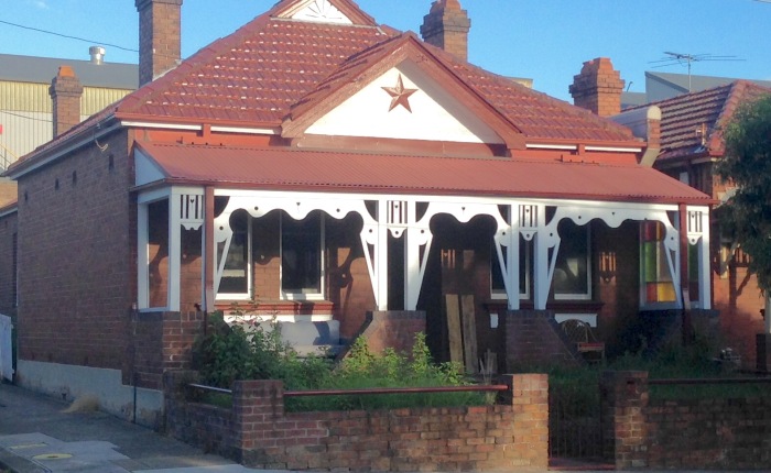
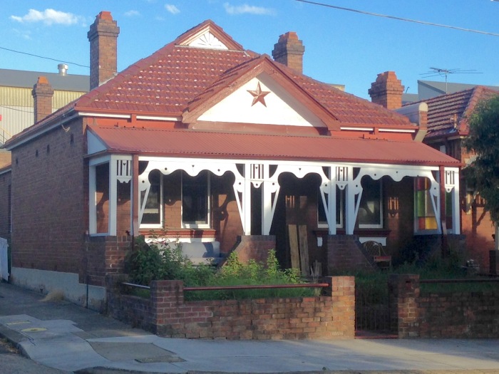
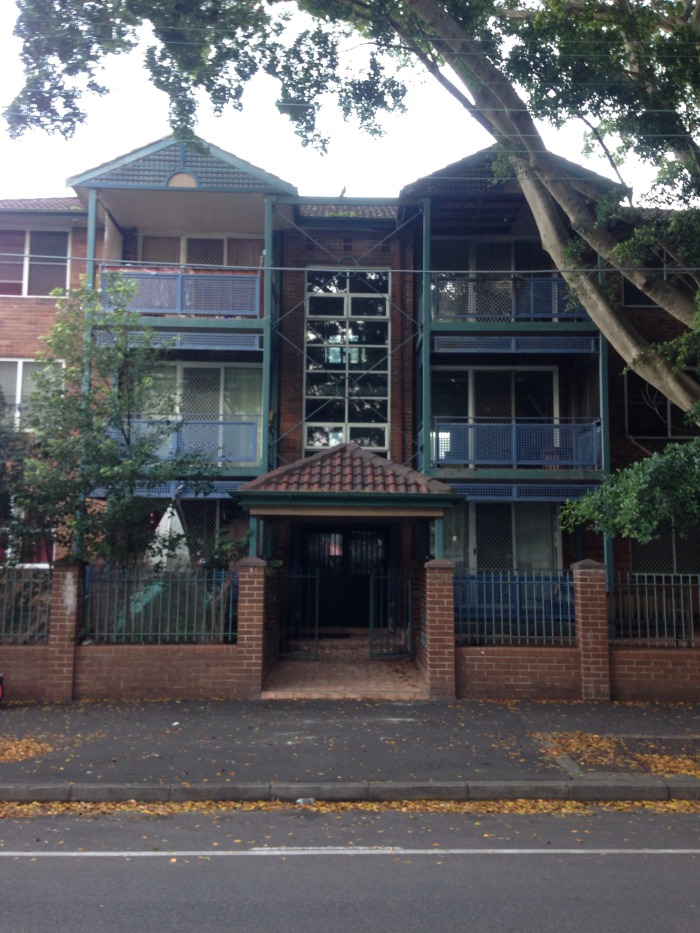
Walker Street Housing, Redfern by Peter Meyers
The general consensus is that the redbrick walkups which emerge like incongruous tombs amid single storey suburban houses are an architectural crime: no balconies, typically surrounded by cement driveways and carparks, with jutting air-conditioning vents and TV aerials the only features breaking up the monotone blocks of red clay.
Imagine the colour of a redbrick walkup changing to blonde. Imagine the addition of a balcony featuring gelato coloured latticework (green, yellow, blue and pink) and occasional deco forms represented in the patterns of cast iron railings; imagine corrugated iron roofs painted green; imagine windows with curved arches and awnings looking a little like baseballs caps before it became customary to leave the brims flat; imagine cosy little gardens with some glossy leafed trees and bushes partially obscuring the facade. Now you have imagined the outside of late twentieth century postmodern architecture in inner Sydney.
Listed off in such a way, the differences might seem minor, however the effect it is not superficial. In particular, the sense of inside outside space afforded by the balconies and small frontyards, the comparative softness and vibrancy of the foliage, the playful detailing and colour, and variety of forms and shapes all make for a perceptual experience that is far richer than what is afforded by the comparatively barren, redbrick clumps.
The architect of one of the exemplars of this style, Peter Meyers (thanks to @kmarchitect for this reference), specialised in public housing and had a nuanced appreciation for the relationship between the specifics of the Sydney landscape and housing (https://architectureau.com/articles/the-third-city/). His houses on Walker Street in Redfern eschew the more obvious stylistic references to deco evident in the cast-iron fences in a similarly styled block next door. Instead Meyers’ housing features plain but appealing lightweight, sheet metal screens for balconies balustrades and fences, with the latter at a height sympathetic to the bodily dimensions of pedestrians, unlike the common colourbond of late twentieth century suburbia, and the epic bush screens and imposing brick or stone walls of larger houses in the east. The small but fitting front yards make a huge difference to the visual amenity of the street, particularly when compared with a cement carpark and roller door garage.

The three storey blocks are narrowly overshadowed by the fortuitous presence of a relatively long avenue of Port Jackson figs. When combined with the smaller shrubbery in the front yards, the mutli-dimensional diversity of non-dominant scales work together to create an overall landscape effect that is at once open and intimate, a good enough exemplification of the “highest urban ideal” Meyers observed in the “close-nurtured forest” to the North and West while walking along Flushcombe Road from Blacktown station in his article on future housing, “The Third City.”
A couple of other minor details set the Walker Street housing apart. The balconies extend back into the facade, rather than merely jutting out like scaffolding as they do in the comparably styled block on nearby George Street in Waterloo. Again, the effect is a further richness through contrast.
Other examples of the style can be found in different formats along Walker Street, and on nearby Kellick, Phillip and the aforementioned George, which while perhaps not as architecturally distinctive as Walker Street does feature lush, well cared for gardens that envelope the building.
Jones Street, Ultimo, architect unknown
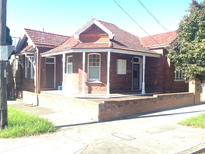
The street atmospherics are vastly different along Jones Street, which lacks the avenue of large trees on Walker Street and, like a lot of Ultimo, feels very much a place of the car. Like Walker Street, it is a three storey, largely blonde brick, domestic apartment block. The fencing on the balconies and walkways is light blue, pink and yellow, and as is typical of the style, a bundle of superficial references are made to classical (segmental pediment), Victorian (gables and dichromatic brickwork) and Art Deco (stepped motifs). It lacks the reference to the rural vernacular made through corrugated iron, which is used in the awnings at Walker Street and the Glebe examples below.
Discretely perceived these references do seem superficial and the referential aspect is largely trivial. However, the overall impression lifts the building from just another brick walkup to something that is at least interesting to look at, for a while.

But the Jones Street block is remarkable exemplar of its type due the pediment type feature that sits above the entrance, where someone has clearly had a bit of fun. The design features a stepped, pink pyramid, in painted steel that slots into a background of tiny, pixel-like, bright blue tiles. The motif is repeated in white outline on the well-made glass door, which is bordered above and to each side by glass bricks.
In an otherwise monotonous part of the city this little flourish irrigates the atmosphere with colour and style like a rare metaphor in Kafka.

Various locations, Glebe, architects unknown
In terms of architectural history, Glebe is among the most interesting suburbs in Sydney to walk through. The abundance of churches and ancillary religious structures testify to its central place in the early days of the colony as a place for spiritual education. There is a both modest and grand expressions of Regency, Victorian (both Italianate and picturesque gothic) and Federation domestic architecture. This is the motley from which the architectural character of Australia emerged.
The architectural heritage of the suburb seems to have been acknowledged in some of the more recent apartment blocks. One variety references the churches and the picturesque gothic style evident throughout the suburb. As with the apartments above, blonde brick is the background against which the more expressive flourishes are executed. At No.4 Mt. Vernon Street these are witnessed in the steeply pitched gables, which feature in a curiously asymmetrical conglomerate, capped by corrugated iron roofing, nesting in behind some palm trees, no doubt riddled with nasty spiders. The redbrick trimming and arched windows lend further interestingness.
Another similar example can be found on Glebe Point Road. Again its a combination of yellow (this time orange tinged) brick, steeply pitched gables and corrugated iron. The awning beneath the gable, above the second storey window, is a showstopper: featuring three and two half gables of its own (I suppose that’s what you call them, in an awning?) painted in bright blue, displaying a triangular star via a series of circular perforations, emanating from the centre of each. Against the cherry red of the painted corrugations above the resulting impression is definitely more jumping castle than castle.
Down the slope towards Wentworth Park, on Mitchell Lane, there is another variety. This time none of the gothic references, but the patterned dichromatic brickwork running along the parapet and trimmimg suggest an attempt to reference the Victorian Italianate terraces common in the suburb. Once again corrugated iron is a feature, this time in curved light-green roofing and awnings (maybe a touch of Murcutt?) and in one example at least, a strikingly peculiar asymmetry prevails. Small rectangles of glass bricks (twelve in each) embedded in the side walls of the lower storey are a further quality to compute.

On the opposite corner block, there’s yet another example, the most distinctive feature of which are the lower storey awnings which skirt the entire block and the ornamental lattice work in the protruding balconies. Perhaps here we have the missing type to make the catalogue complete: the Queenslander?

Laudable ideals to do with liveable, affordable, functional housing gives midcentury modern domestic architecture extra purchase beyond the aesthetic and symbolic. It remains to be seen whether the similarly laudable ideals of the postmodern movement—advocacy for play and diversity seem the most profound—will be resilient enough to transcend the context from which they derived their initial meaning. Though, with my postmodernist cap on for a moment, it would be wrong to assume that anything more than sheer frivolity is needed to guarantee enduring influence.